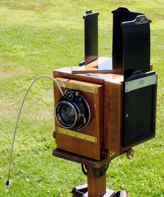
The Anticomar lens is not the original spec, though the FL and aperture are suitable. A Meyer Doppel Plasmat f/4 was usually fitted. The attachment of the Anticomar’s mounting ring is far below Bermpohl standards, and previous screw holes show it to be a replacement. I put a torch inside in the darkroom, and found quite a big light leak around where the lens flange fits to the lensboard. The flange is non-original and not properly fitted, the spigot is several mm smaller than the hole, so no surprise. I found a ring in stock that fits the spigot properly, machined a relief in the wooden lensboard in the lathe using the 4-jaw chuck, so now the lens flange connects light-tight to the panel. The focusing rack is quite stiff; it also locks. It’s immediately obvious that the groundglass image is dim, and will need care to set up. The camera is also very heavy and needs a solid tripod, in my case a Gandolfi with its platform. If you look through it with all the filters removed, the image at each window is of course dim - it is also far from neutral in colour, being brownish. On closer inspection the mirror nearer the lens transmits orange (minus blue), and the one further back transmits green. This is all part of the method of suppressing unwanted internal reflections - but surely the filters should do that anyway? All this light loss raises quite serious problems; the instructions recommend exposing 25x as long as a simple camera in the same position - my experiments suggest that's optimistic, and around 40x is preferable. For ISO 200 film, that means exposing at about ISO 5. I have been making modified darkslides, and working out a suitable exposure and processing regime. The camera came without darkslides, but I had a set of 3 ZI double darkslides which I could fit with some careful wood trimming and insertion of adaptors for sheet film. All that is now sorted, as is the elimination of light leaks and some preliminary trials of exposure. Focus: The GG is 4.2mm back from the reference surface, and the film in the (non-original) darkslides is 6.2mm back. The short term fix is to move the lensboard backwards 2mm after focusing.
 There are various defects - the registration of the three negatives isn’t perfect, which seems to be down to the internal alignments of the camera, and the colour rendition is noticeably non-uniform across the scene. That’s partly because the first mirror is not perfect, some of the silvering has suffered a bit of mechanical damage. And the depth of field is insufficient for the depth of the scene. Nevertheless, it is all quite encouraging, and begins to show why for a while this approach was quite popular with professionals, mainly for portraiture and advertising. Apparently nearly all Bermpohl’s output went to the USA, mainly to studios that produced luxury advertisements. The three negatives could of course be worked up directly into printing plates. I guess the next step will be to go outdoors where exposure will be easier to manage. Choice of location and subject will be tricky; obviously a colourful subject, but it needs to be in a readily accessible space. The camera is so heavy, and despite that I suspect not very robust, that I can’t just chuck it in the back of the car and go looking! I suspect that they were seldom taken from the studio, though I’d think there were bound to have been at least some beach/fashion pictures taken in 1930s California. My trials will be less demanding. A note on post-processing:
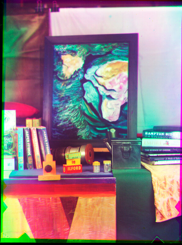
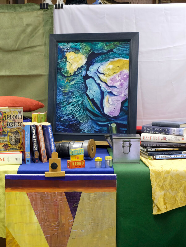
The product of each shot is a set of three monochrome negatives recording the primary colours in the scene. These days, they must be scanned and assembled in the computer to produce the colour image required. I use Affinity Photo for this, which does it easily: If possible include at least a greyscale in the picture. Do the initial scans and flip so all are the right way round, and positive. Preferably scan all three as a single operation and then split them, to get correctly proportioned exposures. In Affinity Photo: Import the three images as a "live stack" with alignment. Copy the three layers of the stack, paste them above the live stack, delete the live stack. Make sure you are in RGB mode. Select the R layer, go down to Channels, find the R layer’s own channels. Right click the G and B in turn, and clear them. Repeat appropriately for the other two pixel layers. Select all 3 pixel layers and change the blend mode to lighten. Tune the individual colours with a Curves layer dedicated to each pixel layer. A good starting point seems to be to adjust the various greys (dark, med, light) so the colour picker shows reasonable balance between the channels for all. Finally another Curves layer above all, to tune up the overall result.
1 Comment
|
ReflectedAn occasional and irregular blog, mostly of photographic experimentation and photographic history. Archives
June 2023
|
 RSS Feed